
Over the next two posts, we’ll be exploring the importance of color and some design rules regarding color placement.
There are several ways to approach color in decorating. In my book, “The Styleprint Design System,” we decorate first for use or function and then bring in look and feel.
You’ll eventually identify your color theme, its placement and the medium used to apply it. But first, you have to figure out how you want your room to feel – identify three words to describe how you want the room to feel.
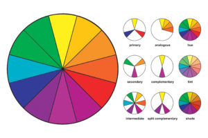
If you want the room to feel larger, light, and airy, you will select lighter colors, as light colors recede and give the feeling of expanding space. If you want to make the room feel warm and cozy, less large, you will select deeper shades of color. For the warm feel, you will gravitate toward the warm tones of reds and yellows.
Are you looking for something that is relaxing? Blues and neutral tones will be your direction. Do you want stimulation and contrast? That calls for a black-and-white combo: deeper shades of one color mixed with neutrals or lighter tints of the same color for a monochromatic effect.
Design tip: When considering color in your decor, consider colors that you tend to favor. A great place to get a visual sense of this is your clothes closet. What colors are in there? Think back about color choices you have made in the past, and write them down. Do you see a pattern? Are there colors that represent the locations you’ve traveled to that make you smile?
Need more help with how to pick the right color(s)? Pick up a copy of our comprehensive design book, “The Styleprint Design System” where we explore the importance and how to use it in greater detail. Stay tuned for our next post which will cover some design rules related to color placement.


