
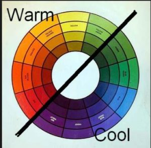
When it comes to choosing colors for your design project there are several aspects to consider. One of these considerations is the use of “warm” tones versus “cool” tones. Cool colors have blue undertones whereas warm colors have yellow undertones.
These are psychological temperatures. Cool colors include blue and cool whites. Colors with a red tinge, including yellows, are warm. Warm colors “advance”—they appear to come forward, have more prominence—while cool colors recede. If you have a small room and want it to look bigger, use cool colors instead of warm colors and lighter colors instead of intense colors.
On the other hand, the main challenge in decorating “great rooms”—those rooms that are large (20 feet by 25 feet and larger) with high ceilings, vaulted ceilings, or cathedral ceilings—is making them feel cozy. To make a great room seem cozy, we have to pull the room in through furniture placement, colors, and textures. Furniture groupings will pull conversation areas together, and textiles and textures with darker, deeper, richer colors will help cozy up this kind of space.
Be sure to take a look at some of my other posts on color to get additional tips. Also, pick up a copy of “The Styleprint Design System” to get a comprehensive guide to color and everything having to do with your next redecorating project.


